HealthEngine

How might we...

completely automate product upgrade and activation?

Project summary

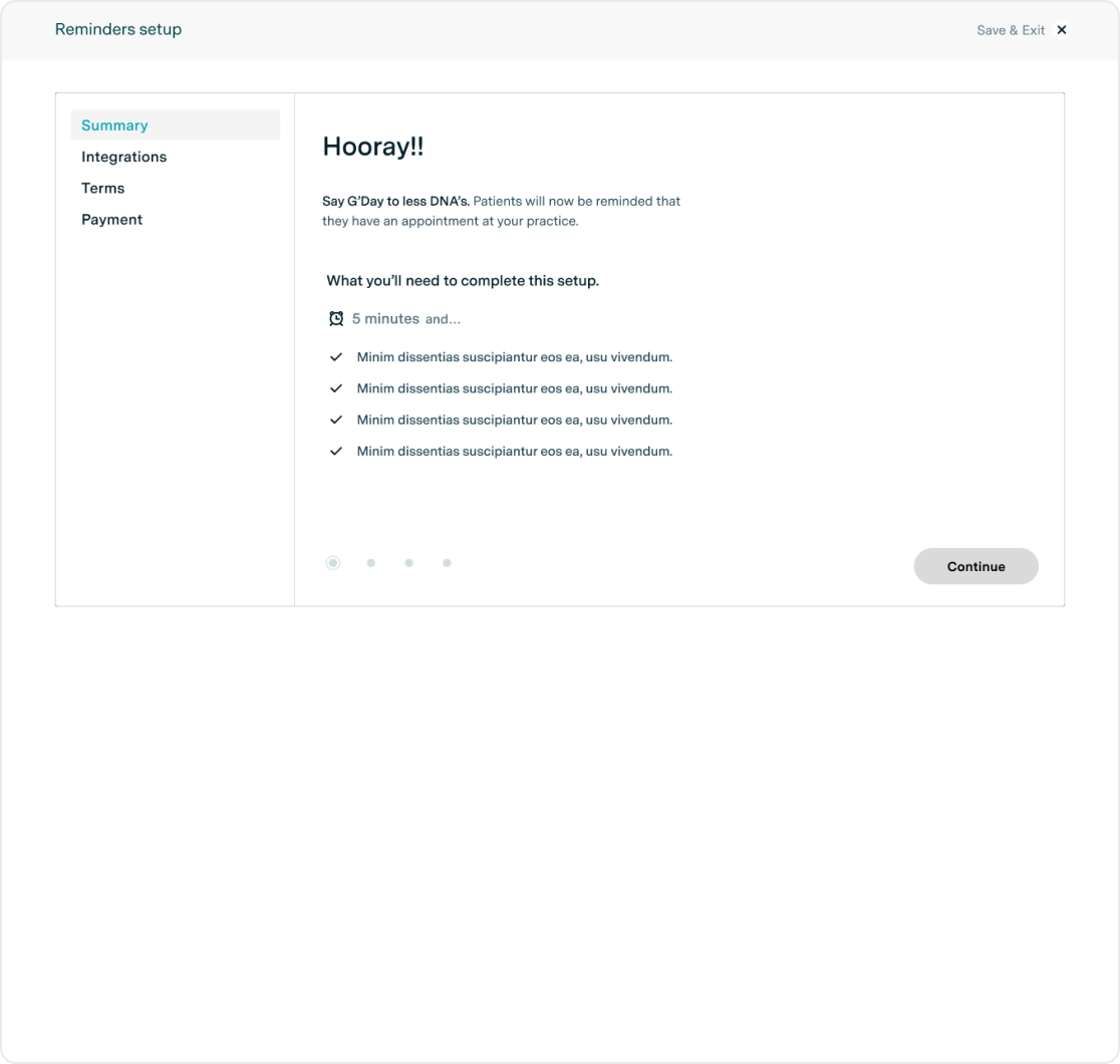
In 2019, with a deadline of just 4 weeks, we defined, designed, built and implemented an automated product activation experience. Once completed, it decreased our integration queue time by 700% and reduced time-to-activate by 1000%. No joke.

This foundational work has now been extended to handle customer on-boarding, lead-generation, user tutorials and much more.

My role

At the time, I was the lead UX/UI designer supported by my boss, who lead the overall project. I worked closely with other designers, product managers, engineering managers, engineers, support and customer success teams.

Once designed, I became the key point of contact for our engineers. Guiding implementation, removing usability roadblocks and ensuring our minimum viable product had a minimum viable experience.

Project specifics

lead ui/ux designer
web (desktop/mobile)
react
b2b
2019

The problem

The integration and customer success team can’t keep up with product activations for our General Practice customers.

An influx of sales meant the integration team couldn’t keep up with customer demand for product activations. A crucial part in our customers using their product. This was leading to resource issues, an uptick in customer churn and a poor experience for our practice’s patients. The business needed a solution, and quick.

Defining the contributing factors

The product activation process involved a lot of ‘hand-holding’ and repeatable steps. This was inefficient.

An influx of sales had added to our integrations team back-log. A small team already at max capacity - now with more things to do.

Our goals

With business requirements and our contributing factors, we set ourselves some high level goals to help guide our solution.

Empower our users to act on their own behalf.

Free up time for our integration team.

Be scalable and extendable.

Be shipped as an MVP in a month.

Identifying personas

Curating the list

Activating a product could come with a series of flow-on effects for the Practice. Ensuring we only allowed the right person to activate was essential.

With the customer success team, we curated the list of personas to focus on by ranking them on:

Level of Authority
System knowledge

Our focus personas

'5,000 things' Carol

Carol is a Practice Manager, meaning she had her finger on the pulse of the practice. She cared about things being done quickly, and within her control, with constant feedback and questions answered immediately.

primary persona

Astute Angela

Angela is a principal practitioner and owner of the practice. She trusts her staff to do their jobs but loves having a paper trail she can review if needed. Any increases in platform fees must be discussed with her.

secondary persona

Identifying MVP focus

Using a recently created Service Blueprint we worked on identifying what in the process could be automated or removed entirely, what can't be automated and what products had similar steps or set up concepts.

Due to sensitive information, I've had to blur the details

The product champions

Based on our analysis and the business priorities, we selected 2 products to form the MVP process.

Appointment reminders
Waiting room

Mapping the user flow

Taking the high-level activation steps from the service blueprint, we had a list of internal processes and teams we could lean on to help clarify content. Boiling down the processes we established the requirements for a user to flow through the steps and activate their product.

A simplified version due to sensitive information

Early feedback

We eagerly shared it with the project team. Walking through the process, we discovered a few gotchas, which raised a few concerns for some departments.

Consent first

To make sure the person making changes had authority, and to ensure we had consent before changes were made to a product, we moved the consent step to the start of the process.

This step was essential for our primary persona, Astute Angela. It also served a legal purpose as new products would require an update to the customer’s contract with us.

Integrate, sync, setup

The customer connects to us, syncs their information, then configures the product. That’s the systematic way.

Those steps weren’t in that order in our flow, so we re-ordered the steps to ensure a 1:1 relationship with the system and so there wasn’t additional actions the user had to take at the end of the process.

Developing the wireframes

HealthEngine’s Admin platform (Practice Admin) was the natural choice to host this experience. Our personas were familiar with it and had it open all day.

To ensure our personas could focus on the steps to take during an activation, we created a new single-task focused experience within Practice Admin, but away from the distractions of the day-to-day operations of the practice.

Essential elements

Navigation

As each product had a varying amount of steps required to activate, we needed to create a navigation system that allowed for pages to be added or removed based on varying levels of hierarchy.

Content driven components

From the user flows, we understood what content to expect. We now had to define the shape of that content.

We created templates that could accept any content you gave to it, of course if it was the right content for the page.

Above are a just a handful of the wireframes I designed for each blow.

Prototyping & Testing

Testing our assumptions

To ensure the information and interactions were understandable and felt right for our personas, we conducted user tests.

Due to the fast paced nature of this project, we opted for internal testing with our Integration and Customer Success teams. Their worlds revolved around walking customers through these processes daily, so they were a time effective fit.

Unfortunately I didn’t get any photos of the user tests. This, however, is an accurate representation of how my user testing sessions generally go.

User testing insights

Based on the insights obtained from the user testing, I categorised them further into three main changes we needed to make to our experience.

Setting better expectations

Our proto-testers raised a blocker from the start. “What happens if I go through this? What will HealthEngine do? What will happen to my system?”.

Even though our personas had the authority to activate, they were still hesitant to do so. There were too many unknowns in completeing the process. Would every patient recieve an email? Would their information be compromised in some way?

We’d communicated what to expect about the process itself, but we hadn’t communicated what the outcome would be once they had completed the process.

Focusing on the expectations

A summary page communicated ‘process’ expectations within the main activation flow, however, the content on that page caused a big cognitive barrier for multiple of our users.

To reduce the cognitive load and streamline decision making, we re-prioritised the Summary page. By upgrading its heirarchy to become the first decision gate, it meant we could assign it the sole focus of answering the question “Should I activate or not” and “What will happen when I do”. See above.

What Next?

Our internal testers reflected that completing the activation is only the first small step in the entire journey of using a product. There’s always a “What do I do next?” question.

To preemptively answer that question and continue our users on their journey, we created a success page that contained videos, links to how-tos and best next steps.

Food for devs

Throughout the entire process, our engineering team were close by. Including them on the journey meant that even before we had finalised wireframes, they had already begun defining the back and front end requirements.

Now with requirements a little more concrete, we handed over the defined flow, page structure, interactions and initial content.

Hi-fidelity design

The cherry on top

With a lot of our fundamental layouts and content shape defined, our devs were busy working away on the underlying architecture.  In parralel, I began adding the final coat of paint on the components and templates needed.

Extending the design system

Our design system’s foundations had been established at this point, with components on the road to definition. A number of components and conceptual elements throughout this experience became staples in the design system.

Dev handover

I developed a process with our front-end engineers that allowed for rapid implementation, feedback and iteration with myself. At the time, we used Sketch to design, Zeplin for dev handover and Storybook to mock up the React components.

The outcome

This project had a large impact to the business. It was officially launched for General Practice customers just after May 2019.

This impact of this project?

700%

Decrease in integration queue time. From hours to minutes.

1000%

Reduction in time-to-activate. From Weeks to days

1 month

MVP delivery time. From identification to customer usage.

What else?

I’m super happy to say that this foundational framework has now been extended to:

New customer onboarding, including accepting payment.
New product set up and tutorials.
Lead generation.